
A well-framed photograph feels intentional without competing with the image. The right mat, frame, and glazing can give a small print more presence, suit the room, and help guard against dust and damage. Start by considering the photograph’s colors, size, and purpose, then choose materials that support both its appearance and preservation. Whether you are framing a family portrait or a fine-art print, a few thoughtful decisions will make the finished display feel balanced and ready to enjoy.
Choose Matting That Gives Space
A mat creates visual breathing room between the photograph and the frame. It can help a small image stand out, separate the print from a busy wall, and keep the photograph from touching the glazing. Choose a mat color that supports the image rather than matching every detail. Soft white, warm ivory, or a muted tone drawn from the photograph often works well.
The mat border does not need to be identical on all sides. A slightly deeper border at the bottom can make the image feel visually centered, especially in a portrait-oriented frame. For a clean presentation, keep the mat opening smaller than the print so it overlaps the edges slightly. If the photograph has a white border or signature, ask a framer to plan the opening so those details remain visible.
Get the Proportions Right
Consider the photograph, mat, and frame as one composition. A narrow frame and modest mat can suit a small, intimate print, while a larger mat can give a detailed or high-contrast image room to breathe. The frame should not overwhelm the photograph, but it should have enough presence to hold its own on the wall.
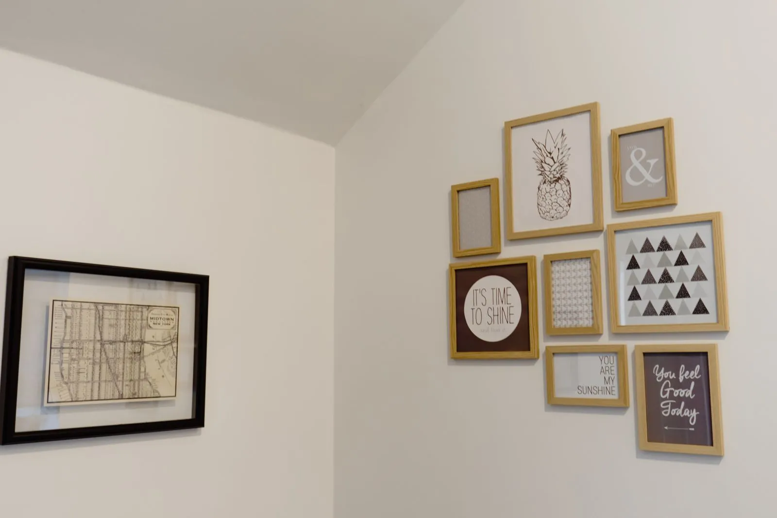
Before committing, measure the available wall space and note nearby furniture, artwork, or architectural features. A paper template in the proposed outside frame size helps you judge scale before the piece is made. For a gallery wall, compare the finished frame sizes together and leave consistent spacing. For a single statement piece, check that the overall frame size suits the wall rather than only the print.
Select Glazing for the Setting
Glazing shields a photograph from dust, handling, and accidental contact. Standard clear glass is one option, while low-reflection glass can reduce distracting glare in bright rooms or opposite windows. Acrylic glazing is lighter and can be a practical choice for larger frames or locations where breakage is a concern. Each option has different handling and care requirements.
Light exposure matters as well. Direct sunlight and strong, prolonged indoor light can cause photographs to fade, even behind glazing. Hang the frame away from sunny windows when possible, and use suitable UV-filtering glazing when added protection is important. Glazing does not make a print fade-proof, so placement and sensible light control remain part of caring for the image.
Match the Frame to the Photograph
Choose a frame that complements the photograph’s mood and the room without pulling attention away from the image. A simple wood frame can add warmth to family photographs, while a slim metal profile may suit a crisp, contemporary print. Dark frames can define an image with strong contrast; lighter finishes can keep a delicate or softly colored photograph feeling open.
For a photograph you value, ask about archival-quality materials and a mounting method that avoids permanent contact with the print. Materials designed for conservation can help reduce the risk of discoloration or damage over time. Ottawa Frame Studio can help you compare mat and frame combinations, but bring the photograph and a sense of where it will hang so the choices reflect the actual display.
A considered photograph display balances the image with its mat and frame, then adds glazing and mounting suited to the setting and the print’s needs. Measure the wall, think about light and glare, and compare samples before deciding. For help choosing a combination, contact a local custom framer and bring the photograph you plan to display.